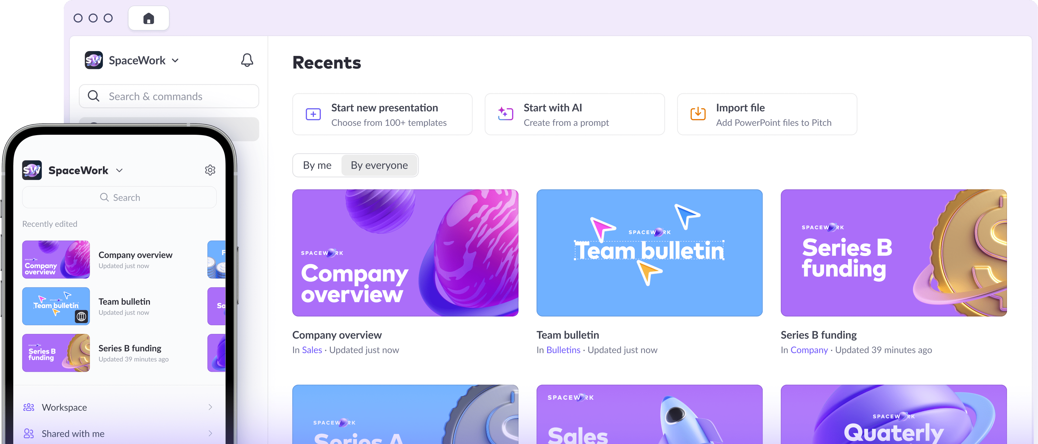


What makes a presentation successful: An 11-step checklist


Ever thought about how the skills you need to succeed at work don’t match the ones you learned at school? Presentation skills, for instance, can make or break a career — but how many of us were actually taught how to build a deck? And even when we're lucky enough to get feedback, it can be super specific, like “You need to add a source,” or weirdly vague, like “Can you just make the whole thing a bit more… sexy?”
Especially in the world of business, presentation-building skills are a must-have, whether you're a seasoned executive or just starting out in your career. A great deck can help you win over new clients, convince your boss to take a chance on your idea, and even inspire your team to work toward a common goal.
There are a lot of different reasons you might need a presentation. Here’s my simple checklist for creating a deck that delivers every time.
1. Lead with intention
Clarity and connection are key to winning people’s hearts. It’s important to show that you have a clear agenda — and that you understand your audience’s needs, interests, and pain points. A little empathy can go a long way here.
Start your presentation with a straightforward message that can be conveyed in just a sentence or two. You could write this message on a slide, or share it in your live delivery. For instance, you could say, “When we spoke last week, I heard that you’re frustrated with your current CRM. After this presentation, you’ll better understand our CRM’s features and I’ll know more about your challenges, so we can both decide if there’s a fit.”
2. Capture hearts with storytelling
People love stories. So to capture hearts, your deck needs to have a clear narrative, regardless of the subject matter. The most basic story structure — and the one I use most often — is:
- Situation
- Complication
- Question
- Answer
To see how this story structure works, check out the first five slides of Paddle’s Series D deck, the first half of Pocus’s sales deck, or the intro to Kyle Poyar’s deck on usage-based pricing.
If your topic is more complex or inspirational, and you want to take your audience on a real trip, try The Hero’s Journey structure instead.
3. Set your headlines, then get into specifics
To build your story, start by getting your structure in place. Write out all the headlines of your slides, and check that they form a coherent narrative when read sequentially. Then jot down the information you’ll show on each slide to prove the statement in the heading, whether it’s a more detailed explanation, a chart, an infographic, or a quote.
This pitch deck from startup FORMEL Skin shows how headlines can drive a clear story in just 8 slides.
4. Prioritize visuals over text
There’s a reason you’re using a presentation format instead of email, or a doc in Google or Notion, and it probably has to do with aesthetics. You’ve chosen a visual setup, so make the most of the design possibilities!
The simplest, quickest way to make a beautiful deck if you’re not a designer (and even if you are) is to start with a template. In Pitch, we have dozens of free, professionally designed templates to choose from. They’re versatile and very easy to adapt to your company’s brand for consistency.


If you want to design a deck from scratch, here are a few things to keep in mind:
- Colors: Aim to have no more than three or four colors throughout your deck, and be consistent about how you use them for headings, backgrounds, and body text.
- Fonts: Pick fonts that match your message and tone, and never use more than two per presentation — otherwise it’s confusing and distracting. Also, be ruthless with minimum font sizes. Your headlines should be at least 32pt, subheadings 24pt, body text 20pt, and sources 18pt.
- Images: Simpler is better. Crop and zoom in on the part of the image that illustrates your point to avoid surrounding clutter. Make sure any overlaid text is legible.
- Layouts: Every slide design element should have ample breathing room. Use layouts consistently for section breaks, chart and commentary slides, and other standard slide types.
Need some design inspiration for your slides? Check out this roundup of the winning entries from a presentation design competition we ran with Dribbble last year.
5. Avoid bullet points
Unless your deck is specifically designed for async consumption, bullet points should be used sparingly and kept concise.
Remember, there’s no hard limit on the number of slides you use; the real limitations are the amount of time you have to present and the attention span of your audience. For short decks, if an idea is complex enough to require multiple, long bullet points, it deserves either a separate slide (if you’re presenting live) or a proper body of text (if you’re sending over a deck to be read).
See how Front breaks up their ideas into more slides in their Series C deck. You could also use design to distinguish between ideas, like in Spendesk’s deck below.
6. Charts and data should captivate, not confuse
Make an effort to source the data, case studies, and other information that will win over your audience with logic rather than just emotion. It’s usually the most time-consuming part of building a presentation, but you can convince even the most pedantic person if you make an effort with detail and accuracy.
Keep charts as simple as possible. Strip out complex backgrounds and unnecessary axis labels and lines. Highlight what matters with color and overlay labels. Title your data and charts clearly, and always include sources with links. You can use infographics when presenting one or two standalone statistics as these will be easier to grasp than bare figures.
For inspiration on simple but effective presentation of data, check out Azeem Azhar’s Exponential Age presentation below and Ben Evans’s The New Gatekeepers.
7. Give your audience a map
Most people are overwhelmed by the sheer amount of information coming at them daily and need a framework so that new ideas stick. Help your audience keep track of where you’re taking them by giving them the lay of the land. In other words:
- Tell your audience what you’re going to tell them.
- Tell them the story.
- Tell them what you just told them.
That might seem like a lot of repetition — but your audience will feel clear about the destination, have context on the information you’re delivering, be more likely to grasp the core message, and be able to find a resolution when the promised destination is reached. For a more in-depth blueprint, check out these resources on structuring pitch decks and board reports.
8. (Pre)read the room
People’s moods and receptivity to information are contextual. Carefully consider the environment in which your audience is going to experience your presentation. Are you sending the deck as a preread for folks to look through in their own time? Are you on stage in front of hundreds, or on a Zoom call for three?
If the dominating emotion is likely to be impatience, you need a tl;dr or executive summary slide. If you’re presenting after lunch and the audience will be nodding off, how can you jolt them awake? Maybe it’s time for a shocking stat or eye-catching image.
9. Align your format to your delivery method
If you’re presenting in person, you can get away with very little text, lean heavily on imagery, and even go full Steve Jobs.
If you’re presenting asynchronously — for example, to a team spread across multiple time zones — you can embed a recording of yourself in your deck.
If your deck is read-only, or a preread, you’ll need text to do the narration for you. In the preread case, consider creating two versions of your deck — a text-heavy one to send out ahead of your meeting, and a leaner iteration you can present live.
10. Pause for a break
You don’t want your audience to feel like they’re sitting through a lecture or reading Moby Dick. The key here is to… pause. That means inserting some kind of break at least every 10 slides. Here are some ideas:
- Ask a question, and call on the audience to answer.
- Use section breaks to punctuate your flow.
- Run a poll, even if it’s just a show of hands.
- Take five minutes, and have the group jot down their thoughts on a Post-it.
- Embed a video or GIF that highlights your point with humor.
11. Always include a call to action and next steps
You gave your presentation because you want something to happen, right? So many people fall at the final hurdle and fail to clearly state what happens next, leaving a convinced audience unsure of what’s ahead. But there are ways to avoid this.
For starters, include a clear ask like this seed-stage company does at the end of their deck. The more specific the ask, the better. It might be a detailed pricing proposal, like in Studio Treble’s penultimate slide, or a timeline mapping out next steps. Also, be sure to put in your contact details for later reference. You can keep it subtle, like the last slide in MAD’s studio deck.
Power up your presentations
Creating a great presentation takes time and effort. The good news is, your deck isn’t a one-trick pony. Start with a strong foundation, and then reuse those designs, layouts, templates, styles, and even entire slides wherever possible.
Like with everything, you’ll learn what works through trial and error. Test out your presentation on a lower-stakes audience — friends, family, colleagues, and even investors — before you face prime time. Leverage presentation analytics to learn if prospects have opened your deck, which slides are resonating, and whether anyone has actually done the preread.
And when it comes to presenting, don't forget to practice, practice, practice. It’s the only way to calm those presentation jitters. There's nothing like the high of nailing it — you'll see.