
A peek into our template creation process


As you can likely guess, we spend quite a lot of time thinking about presentations, especially how to effectively design and structure them. In this post, we'll walk you through how we design presentations at Pitch, from initial brainstorming to revisions and finally, the finished product.
We create hundreds of presentations a month. While many are for our own internal needs, quite a few of the presentations we create at Pitch are templates. These could be anything from an SEO report to a template for a company’s brand guidelines. Quite a lot of research and thinking goes into the creation of each and every one of them and, as a result, we’ve developed a dedicated method for designing them. Here’s how we approach the process.
1. Discovery
This phase focuses on research and inspiration. We start with two fundamental questions: why are we building this template, and who are we building it for?
This helps us better understand the stakeholders or personas who may typically use this template. When doing research, we like to speak to those who do a lot of presentations on the topic, like VCs and founders for pitch deck or design agencies for brand guidelines. We ask them what they would find useful and what kind of slides they consider critical to telling their story. We also look internally to see if we have any templates on the topic that we use time and time again.
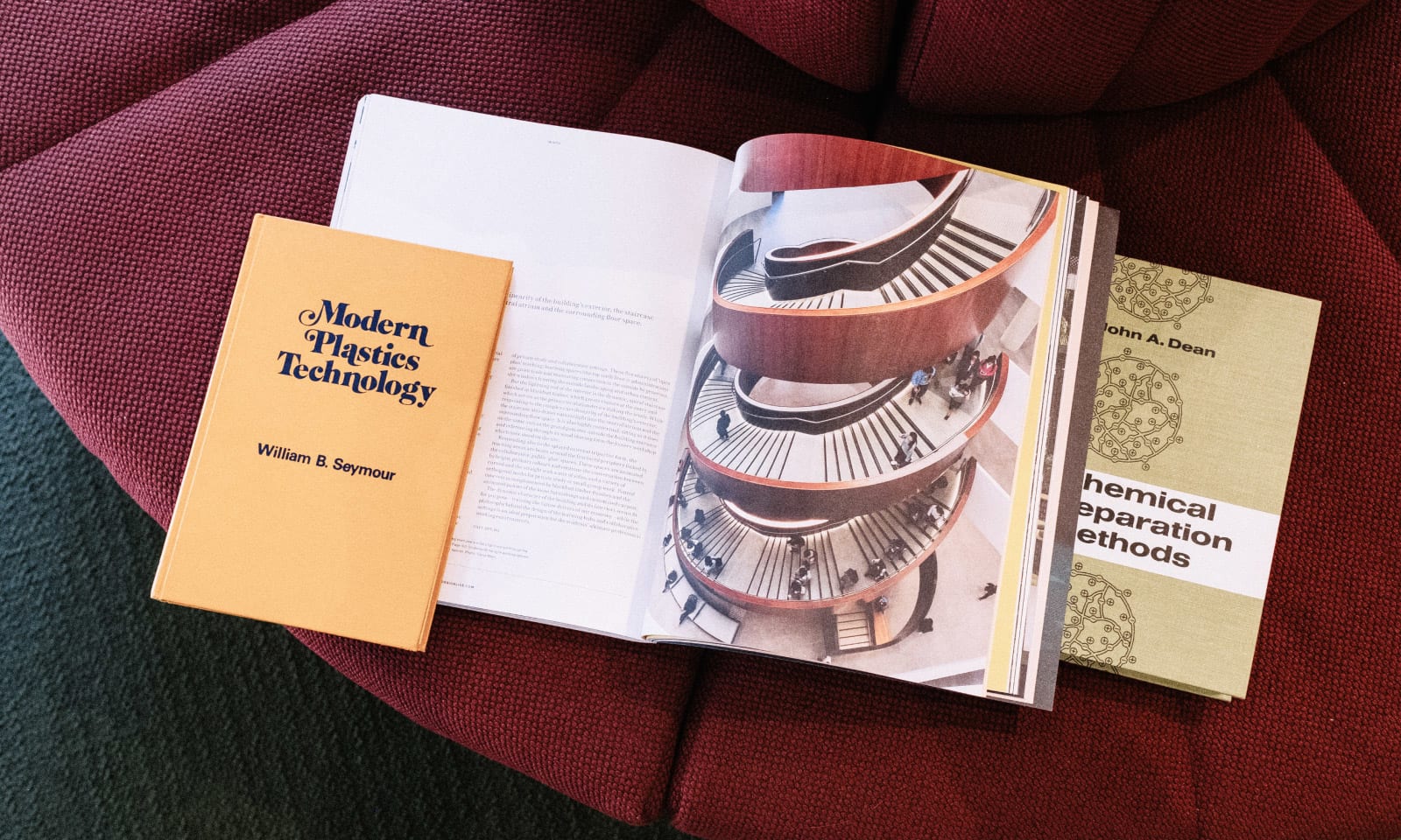
Gathering visual inspiration isn't much different than finding inspiration for designing anything else. There are obvious online showcases such as SiteInspire, Dribbble, and Behance, but my favorite places to browse are bookstores. Books offer a ton of design inspiration, from elaborate, highly visual coffee table books to aged almanacs and history documents. They’re also a good resource for seeing how people lay out information in restricted spaces, which later helps me when I'm trying to figure out how to handle dense blocks of text or what kind of white space is right for a particular slide.
2. Outline
Outlining is a big, big part of the process. Especially when it comes to slides, you have just a little room to get a lot across. Plus, a template is only useful if it can be used multiple times. This means content and design should be collaborating from the early stages. In our case, I work with our content people to nail the copy before I place it in on slides. For this stage, we tend to work in plain text. This way, I’m not distracted by visuals, and it leaves room to move things around for the best structure or storyline.
3. Visual Exploration
It helps to try and go in completely different directions during this phase. How can you know that your first direction is the right one? Try to answer the above questions in different answers, and use those answers to guide the directions you explore.
Here’s an example of the Brand Guidelines template during the exploration phase. From the previous step, I’ve duplicated the exact same content but started designing them in two different directions. The first exploration is more graphic-based. It features the IBM Plex super family which has a nice balance between humanist and tech. The base colors are black and white and we threw in a bold color for a little excitement. The second exploration relies a bit more on photography and a much more subdued and calmer color scheme.
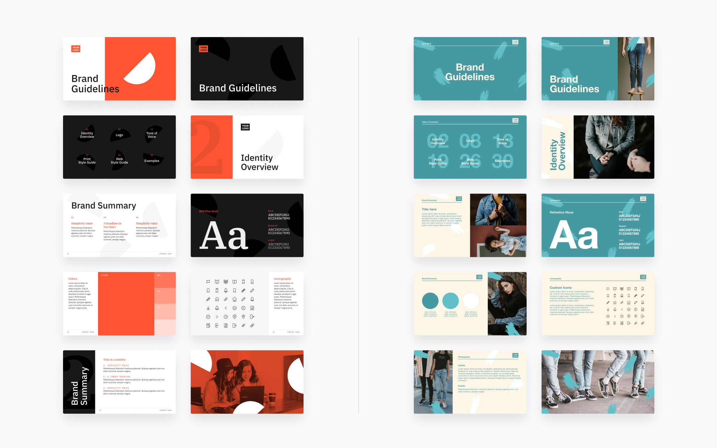
We design our templates to serve as a visual example, knowing the majority of the content will be replaced. Designing presentation templates to be used by other brands is a bit of a unique situation. In the end, templates like Brand Guidelines will be completely customized. We know that most of our templates will be replaced by another company's style, but showing different layout styles and examples of how to get creative with the content will inspire our users with how they can get started and make decks uniquely their own.
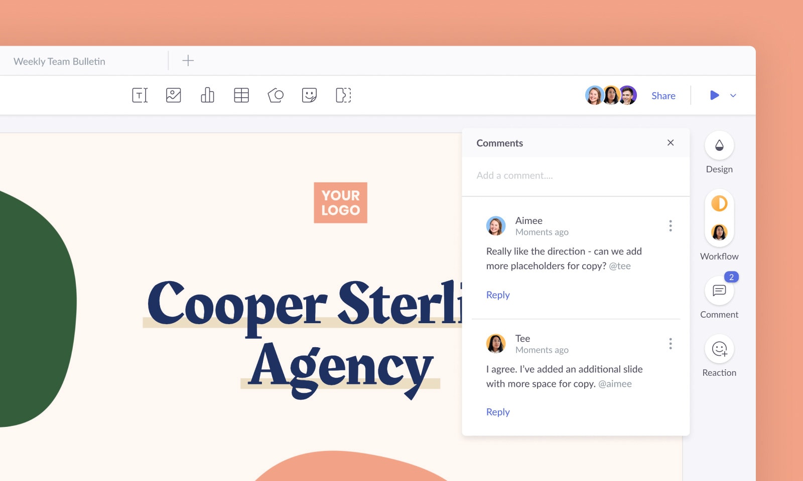
4. Feedback
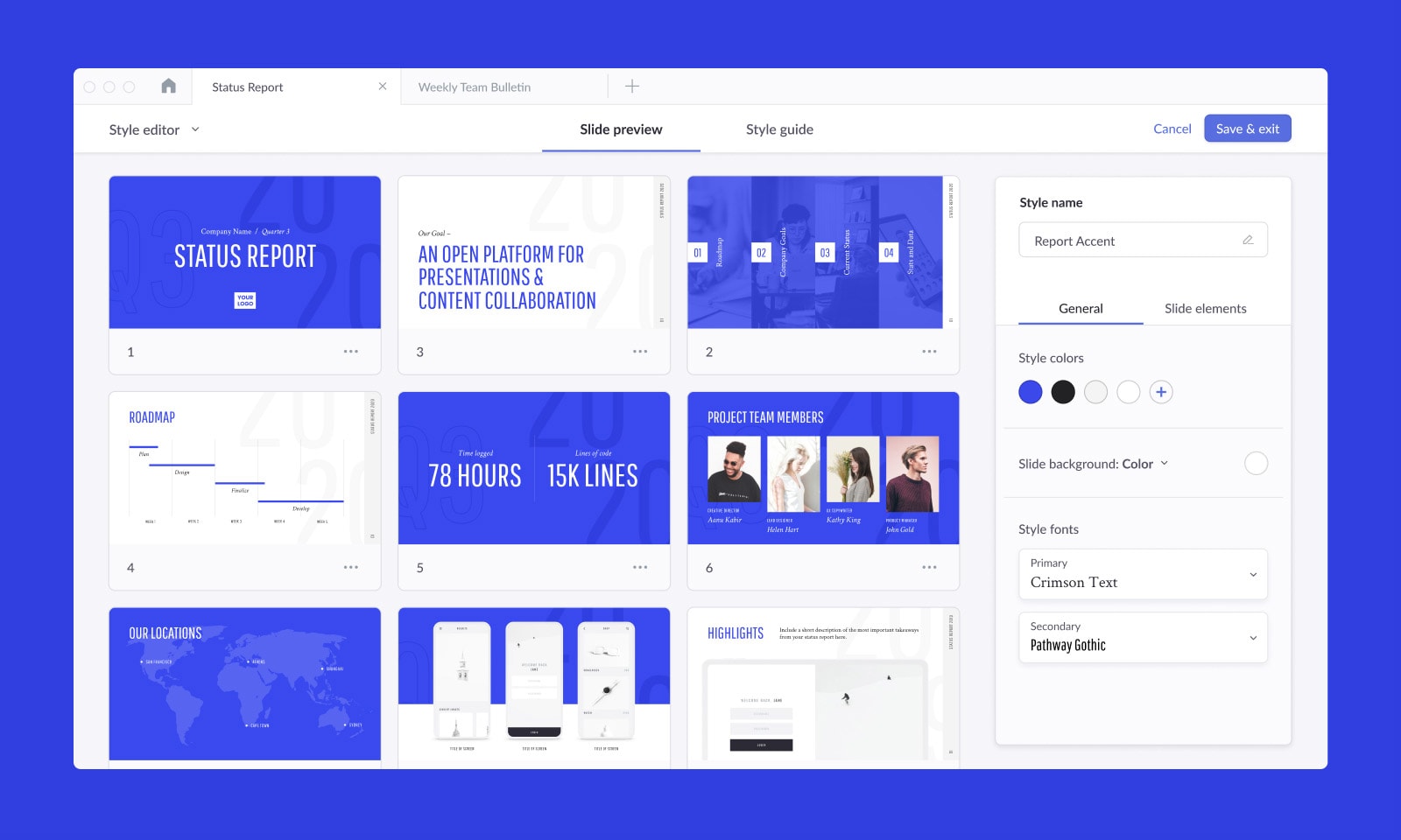
I usually develop two to three design directions for each template, which I share on Slack, in our weekly Design Review meeting, and our company Team Bulletin for feedback. Here’s an example of two directions I was working through for our Minimalist template.

They’re both pretty simple, and I tried to adhere to a grayscale color palette to support the visual theme. The first direction uses three different typefaces and has a thin white border around images, the second direction uses just one typeface with full screen images. I threw this in our #design channel to ask for feedback. Here are some of the thoughts they shared:
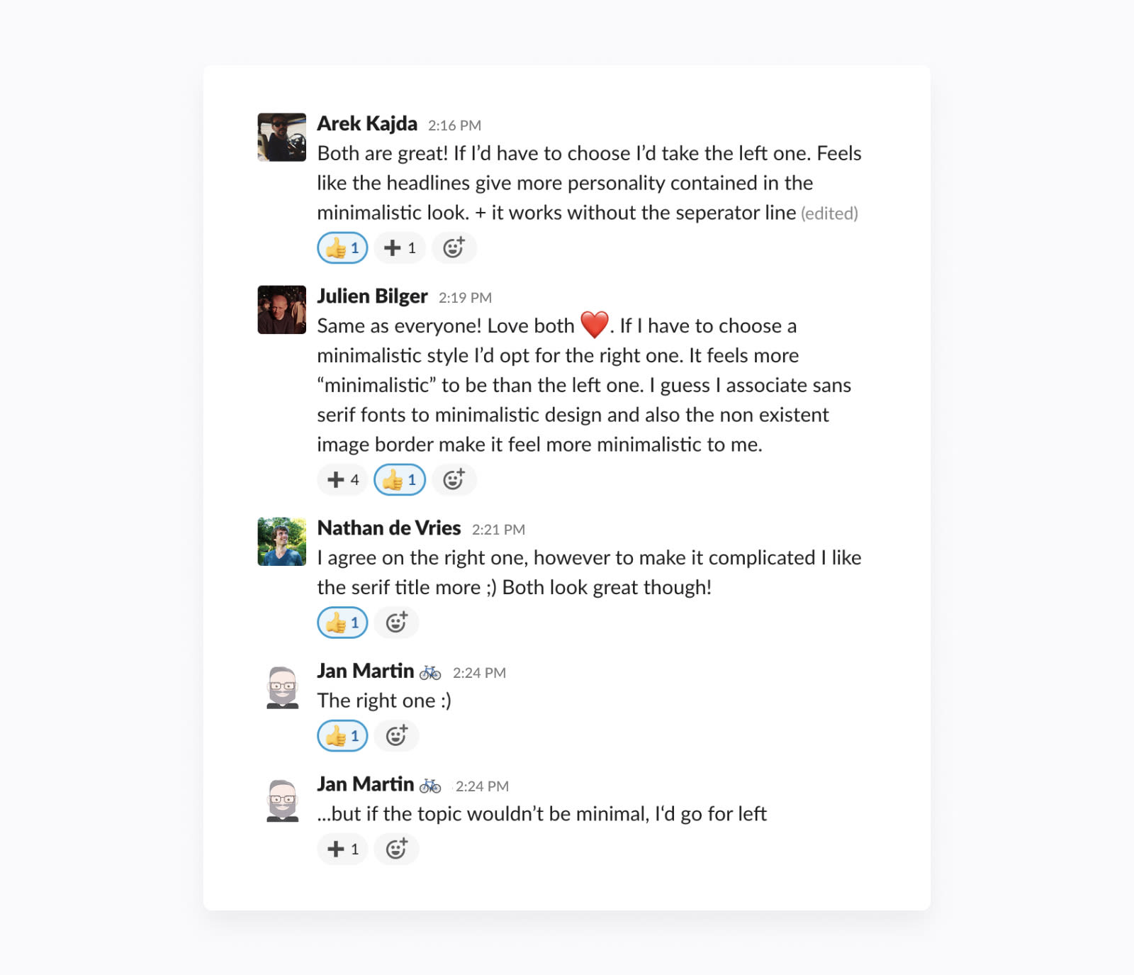
This example is pretty typical: Some people had very specific feedback, while others were more vague. As any designer knows, people’s opinions can often contradict one another. Figuring out why they prefer one direction over another will help you weed out the comments that will be useful for you when moving forward. “This one just looks nicer” won’t be as helpful as “The text here reads better and the colors will attract our target audience more.”
Asking more specific questions can help guide the person you’re asking to give a more helpful answer. In this example, we decided to continue with the second direction as we agreed that using just one font family and less visual decoration better supported the concept of minimalism.
“When asking for opinions, it’s so important to figure out the why.”
5. Reiterate
Chances are, you probably won’t nail it on the first try. When it’s time to refine or re-visit the design of one of our templates, I try to refer to the feedback and understand what will be practically helpful when creating revisions. We usually have at least three people working on every presentation: a designer, copywriter, and project manager or other stakeholder.
And with so many people involved, the revision stage could get messy if we had multiple versions of files scattered in the cloud or lost on someone’s desktop. Luckily in Pitch, we can easily track the status of slides and assign them to specific people to complete.
Conclusion
This is our process for creating templates that don’t just look great but are actually useful when putting together a presentation. But this process isn’t unique to presentation design, and you probably go through something similar when designing logos, websites, etc. I think there’s something to be said about that: This design approach just works. Practice makes perfect. Finding the process that works well for you will take time to develop and test.
Put these tips to use in your own work and let us know how it goes. In the future, we plan to allow users to submit their very own presentations, and we’d love to see what you come up with.