


How to format your ideas on a slide
Now that we’ve covered presentation structure and design, it’s time to delve into the details of your content — specifically, how to effectively arrange it on slides. Text, for instance, can be tricky; it’s tempting to just copy over blocks of words. But learning the basic rules of font and text formatting will make all the difference in whether your message is received or ignored.
Explore this guide chapter to discover how text, fonts, and layouts can be leveraged for maximum effect. Whether you're a seasoned deck-builder or just starting out, these presentation formatting tips will help you craft slides that are both clear and visually appealing.
7 formatting tips for impactful slides
1. Make sure your headline tells the right story
Your headlines are the first thing your audience will see on each slide, so put in the time to make them as captivating as possible. A confusing headline will leave listeners equally confused — and disengaged.
It goes without saying, but your headlines should accurately reflect your message. They need to be clear and concise, especially on slides that contain a lot of data or visuals. The goal here is to capture your prospects’ attention and keep them engaged throughout your talk.
2. Treat presentations as visual aids, not documents
Ever found yourself losing focus during a presentation because the speaker’s slides were overloaded with too much information? You may have started to zone out or read along, both of which are red flags.
Slides should be visual aids — not documents. To keep your audience engaged, you need to find the right balance between text and images. Limit the number of words on each slide, and use images and other visual data to support your message. This doesn’t mean you need to omit important details. Just put them into your presentation script, not your slides.
3. Lay out bullet points like paragraphs
If you need to deconstruct a complex idea, use bullet points to break it down like you would in a paragraph. Create a bullet point for every major argument, and then support these ideas with indented bullet points outlining the details.
Remember to give your ideas room to breathe. Adding enough space between your bullet point sections will keep the ideas distinct and make your slides look neat and tidy.
4. Avoid these six common typographical errors
As outlined in the design chapter of this guide, consistency is key when it comes to presentation visuals. The same goes for the copy on your slides.
It’s good practice to double-check your deck before presenting to catch any mistakes or typos. Here are some common errors to look out for:
- Spelling or grammar mistakes. Scanning your deck for incorrect spelling or grammar is more important than you might think. Even a small mistake can make your audience wonder whether there are other flaws in the idea you’re presenting.
- Changing punctuation at the end of bullet points. Decide whether or not you want to punctuate your bullet points — and then stick to your plan.
- Inconsistent use of font sizes. Font sizes for each text style should stay consistent. Headlines need the biggest font size, of course. Then use smaller font sizes for bullet points and supporting copy.
- Varying font styles. Choose just one font style for your headers and another one for your body copy. Avoid using more than two (unless you’re a seasoned graphic designer who can pull it off)!
- Fickle bullet points. Dots or dashes? Again, pick one — avoid mixing and matching.
- Erratic indentation. Make sure your main and supporting bullet points are aligned correctly so that the flow of information is easy to comprehend.
5. Instead of lists, use a grid or cards
Take full advantage of your slide’s canvas with grids or cards instead of listing your text points in a single, boring column. You can try emphasizing each argument with a bigger font and pop of color, or insert images on different cards. Also, if you want to ensure you’re audience is not reading ahead, use (simple) animations to reveal each new point as you speak.
Incorporating visuals in your presentation is an excellent way to help your audience absorb the information you’re sharing. Many decks in the Pitch template gallery make use of cards, like the consulting proposal, project proposal, and Vacanza templates**.**


If you want to move cards or blocks around on your slides, try Pitch’s smart formatting feature, which enables you to easily swap, wrap, and tidy up your content.
6. Break one slide into multiple slides
You probably have a long list of things to cover in your presentation — but resist the urge to cram all of your ideas into one itty bitty space. Instead, spread them across multiple slides.
This gives your audience the chance to fully grasp each idea, and ample time to digest all the details. Uncluttered slides are easier on the eyes, and your presentation will have a better flow. In short, more is more.
7. Make sure your text is legible
The standard font size rule for presentations is simple: Your fonts should be at least 32 pt for headlines and 24 pt for subtitles. Keeping these text sizes in mind will ensure that your slides are clear and legible — you don't want your audience, especially the people in the back of the room, squinting to read small fonts.
Best ways to leverage fonts in your presentations
Use various font weights
Combining bold and regular fonts is a popular method of creating contrast that’s often used in graphic design and typography. Two different weights of the same font style can provide a visual hierarchy and draw the eye to important pieces of information.
Use two fonts
Another way to create contrast in your copy is to combine two different typefaces. When using two fonts, a good rule of thumb is to pair a serif font with a complementary sans-serif font. Avoid putting together fonts that are too similar in style — you want the contrast to be apparent.
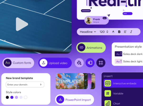
Does your brand have its own font rules? With Pitch, you can upload custom fonts to your library and use them for all your presentations.
Use different font sizes
You can also highlight a point by using a larger font size. This is especially effective when presenting numerical data or statistics. For instance, if sales have increased by 78%, write the number "78" in a large font on your slide.
Pitch’s free modern resume, marketing proposal, and UX research report presentation templates use this strategy too.
Use shapes
Shapes can be an effective way to enhance the visual impact of your message and help your audience better understand the content you're presenting. Circles and squares are great for emphasizing points, organizing information, creating interest, and visualizing concepts — like drawing a circle to show a cycle or a triangle to show hierarchy.
Again, consistency is crucial. Stick to just a few simple shapes to keep your presentation clear and organized.
Get creative when formatting your presentation slides
Placing text onto slides doesn't have to be boring. Have fun with your formatting, whether it’s by using multiple font styles, presenting information through shapes, or playing around with font weights. Just remember not to go too wild. Consistency and clarity are key to creating visually appealing, compelling slides.
In the fourth chapter of the guide, you’ll learn everything there is to know about using photos in presentations — why they’re a vital part of your slides, creative ways to incorporate them, and best practices. Stay tuned.