

How to design a presentation that shines
Have you ever spent hours perfecting the content of your presentation, only to realize that your slides look a little… uninspiring? It's easy to fall into the trap of delaying the design aspect until the last minute, but aesthetics are a huge part of effective presentations. In fact, great design can be the key to amplifying your message and leaving a mark on your audience.
In this guide chapter, we'll explore the essential principles of presentation design. You'll learn how to select the right templates, maintain a consistent style, apply color theory, and choose the perfect fonts. With these design strategies in hand, you'll be equipped to create presentations that have a lasting impact.
Templates vs. styles: What’s the difference?
Visual consistency is paramount when it comes to creating a compelling presentation. It helps your audience follow along and understand the content of your deck without getting distracted by jarring design elements.
You can maintain this consistency in two ways: templates and styles. Let’s look at their main differences, and when to use each one.
Templates: Pre-designed slide layouts
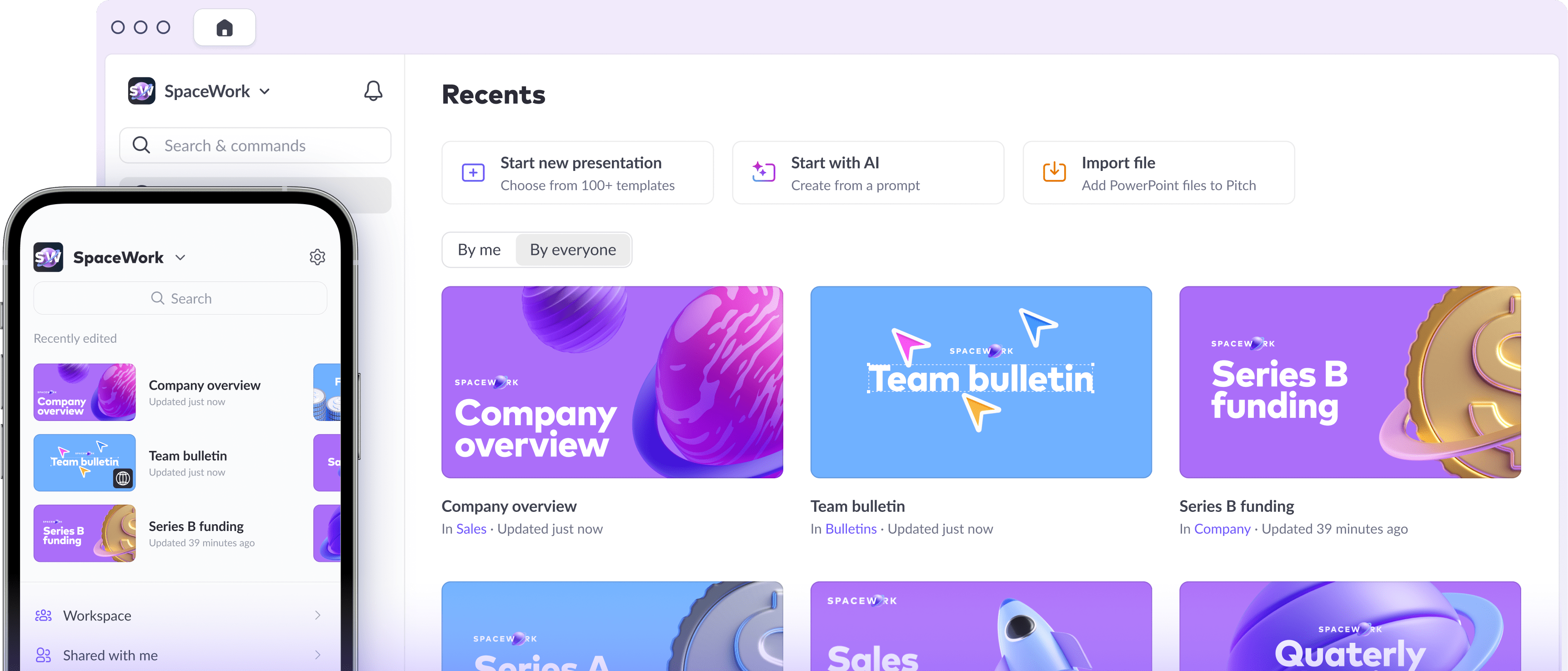
A deck template is a series of slides or styles that you can save and use over and over. If you’re just starting out in the world of presentation design, templates are your best friends. Because they’re predesigned, you don’t need to figure out how to do the visuals yourself. But they can also serve as a springboard for inspiration and customization if you do want to dive in.
Templates keep slide layouts consistent across presentations, which is especially important when you’re working in a team. Anyone can duplicate the full deck, and then delete or customize slides where necessary.


Take advantage of the many free presentation templates available, which cater to a variety of brand styles and moods. To speed up your deck creation, you can also start turning your existing decks into templates.
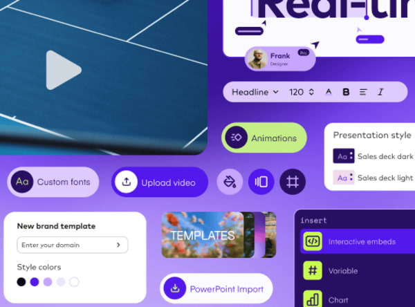
Styles: Consistent rules for colors and fonts
Styles are visual rules for things like colors, fonts, and spacing that determine the look and feel of your slides. Which fonts are you using for headers and descriptions? What is your deck’s color palette?
Knowing the answers to these questions will help you build your own scalable style. In other words, defining a style is important because it becomes the default for any element you add to your slides — be it words, shapes, charts, or images. With Pitch, you can also create and edit styles, then apply them to single slides or full decks.
5 essential principles for designing better presentations
1. Apply basic color theory
Colors can make a big impact on how people perceive your message — so it’s worth learning some basic color theory. Applying it to your presentations can be the difference between dull and engaging for your audience.
To start, let’s get reacquainted with the color wheel. First up are complementary colors, which are opposite each other on the wheel. Use them to draw attention to specific elements on your slides. Create harmony in your presentation by bringing together analogous colors — those that sit side by side on the wheel. By adding white to a true color, or hue, you can create a lighter tone, or tint. Similarly, add black to create darker tones, which are called shades.
2. Select an effective color palette
You don’t need to paint a rainbow on your slides to make them look beautiful. You really just need two to four colors that work together in harmony.
Let’s take a look at a few color-pairing strategies.
Monochromatic palette
This method consists of a single hue that’s rendered in various tints and shades. With only one hue, you may think you’re limited — but you'll find that less is more. Simple elegance is the name of the game here.

Analogous palette
An analogous palette involves using three colors that are beside one another on the color wheel. This strategy evokes a low-contrast design that’s easy on the eye.

Complementary palette
If you want to be sure to catch your audience’s attention, then a complementary color palette is the way to go. Two hues on opposite ends of the color wheel naturally have a high contrast, which in turn creates high impact.

3. Choose the right fonts
There are two basic types of fonts: serif and sans serif. Serif fonts have decorative lines called “tails” or “feet,” while sans serif fonts don't have these flourishes. Research shows that this difference can affect how your audience reads your presentation.
Serif fonts are generally considered more traditional and authoritative. Books and magazines tend to use serif fonts for lengthy body copy because they’re more legible in small sizes. Sans serif fonts, on the other hand, are more modern. They work well when the copy is short or the space is limited, like on signs, maps, and in apps.
4. Consider the personality of fonts
Each font has its own personality. Choose the one that best embodies the topic of your presentation. Trying to sell a new, hipster product? Choose a playful font. Pitching your sleek design services to a potential client? A more elegant typeface might do the trick.
Keep in mind that your fonts also need to be consistent with the overall vibe of your presentation. You can mix and match fonts to make a point, but be sure to use them discerningly.
5. Limit the number of fonts
When it comes to presentations, the golden rule is to never use more than two fonts. You typically need just one font for your headlines, and another for your body copy. Having too many typefaces is like having too many people in the kitchen — things get messy. If you’re not a professional graphic designer, or want to be extra safe, stick with a single font.
And we know the urge is there, but to emphasize text, don’t type it in all caps — no one likes to be shouted at! Instead, try using bold, italics, or color to give your words some pizzazz.
Elevate your deck’s design with some simple rules
Creating a polished style or template for your presentation doesn't require you to be a design genius. Following a few rules regarding colors, fonts, and consistency is enough to make your deck shine.
Of course, you can also skip the design aspect and start with a professionally designed template. Just create a free account, choose a sleek template, and start building your deck.
The next part of this guide dives deeper into the formatting aspects of your presentation. Stay tuned to learn more about photo best practices, how to make words pop, and more!