Why we redesigned Pitch before we launched


Redesigns are difficult yet inevitable. Usually, they come after reaching a tipping point of feedback that proves something just isn’t working right. Rarely do products do a full-on redesign before they’ve even been launched. Here’s why we — in the midst of our beta — rolled out a redesign of the core product experience, and how we made it work.
When it comes to designing our product, we’ve always pursued a combination of aesthetics and functionality. Sure, we wanted to make sure Pitch looked sexy and felt fun to use, but we also wanted to nail the right combination of speed, efficiency, and straightforward UX.
When we were in the very early stages of developing Pitch, we partnered with MetaLab. We wanted them to challenge our initial assumptions about how the product should look and feel. They became an extension of our internal design team during this time, helping us to conduct user research and bringing new perspectives about the product’s design.
We ultimately considered this project a success and ended it confident in the direction we were going. So why, just a year out from launching our product, did we decide to redesign the product from the ground up...again?
Why we did it: The reasoning for a redesign
During the project with MetaLab, we worked many months ahead of the actual implementation process, and after using our product internally and getting real-life feedback from our early beta users, we saw that a few things weren’t working as we’d expected. The dissonance between our design vision (what Pitch could be) and the reality (how users actually experienced Pitch) made it even more obvious that certain areas just weren’t getting it right.
Everyone was excited about the visual appeal of Pitch, yet it felt like we missed the opportunity to challenge the core of the product and make Pitch a tool that offers a simple UX and works fluently across all devices — now, and in the future.
We want Pitch to be modern, not just in how it's designed, but in how we interact with it. That’s why we've always tried to think one step ahead by including initial concepts of future features, like animations or analytics, very early on in the process. Designing for the iPad generation, we knew we needed to consider how the user experience on mobile and touchscreens from day one, not just as an afterthought.
We’re not just designing for today, but for tomorrow.
We didn't set out to make a better PowerPoint, and we aren’t just trying to incrementally improve presentation software. We really want to redefine how modern teams create and collaborate on presentations, from the ground up.
How we did it: Organizing the workflow and task force
We began the project with three main goals in mind: Make Pitch faster, increase user engagement, and make it easy to create beautiful slides. We agreed that each product component we planned to redesign should impact these goals to some extent. To make sure we were designing in the right direction, we split the features and assigned them to a single goal to make it easy to verify our hypotheses.

This notion of forming hypotheses and then following up on them proved to be one of the most important parts of our process: It kept us on track and accountable, ensuring that the work we did had a real impact on the goals.
At Pitch, we work in teams that are responsible for a certain area of the product. Each team is like a gear that enables the entire product development process to run like clockwork. With a core team formed of cross-functional stakeholders from leadership, product management, and product design, this redesign project was a different sort of task force, one that came with its own set of challenges.
Taking designers' time away from their usual teams and work came with the risk of slowing down the process of current feature development. Keeping everyone up to date and involved when they were spread between their usual day-to-day work required coordination and concerted attention to transparency. And in order to make the process efficient, we had to find the right level of detail between a rough wireframe or a fully polished feature. This was a constant balancing act: For some components, we needed to create detailed designs, while for others, we only defined an entry point or provided a walking skeleton.
Challenges: Balancing between radical simplicity and user needs
We quickly found that balance was important not only in how we worked, but in what we wanted to achieve. Going into this project, there were quite a few unknowns, but one of the things we were sure of was that it would only work if we were able to find the sweet spot between a simple interface and functionality.
We’ve been using the same presentation software for years, and over time, we’ve gotten used to the way they work, even if that means making sacrifices and trade-offs. You can either have a cluttered interface that provides a lot of features or trade feature depth for visual appeal and simplicity. We believe Pitch should be both: Simple, but also simply powerful.
Simplifying a product isn’t easy, especially when you’re building for such a diverse spectrum of user needs.
Instead of iterating from the current state of the app, we took a drastic step and made a radical design, which became the basis for discussion, feedback, and iteration. It was a bit like a concept car in automotive design: Start with something extreme and then soften it around the edges to ultimately present a car that everyone can buy (and love).
This was one of the very first layouts from the redesign. It was quite drastic, as we removed all of the UI aside from the slide itself. When thinking about user flows, this design felt too radical. Looking back, it's fair to say that the inline editor for text is our redesign in a nutshell, metaphorically.
With the inline editor we basically made the decision to optimize Pitch for users that aren’t skilled designers by focusing on simple tools that offer the giving easy-to-use tools to the people who will use Pitch on a daily basis.
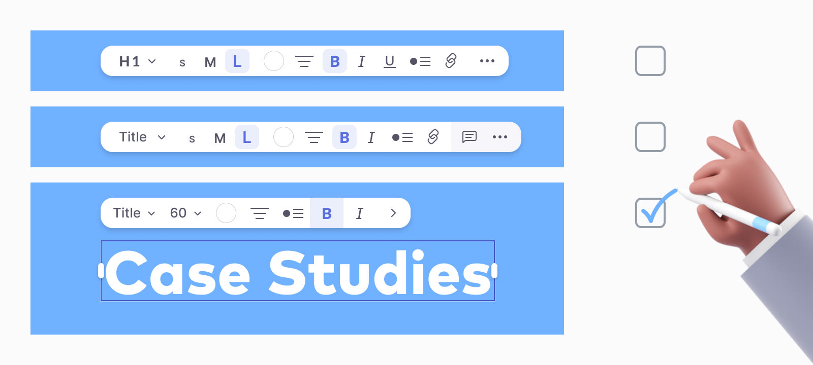
We used text as one of our areas to benchmark if we were getting the balance right between simplicity and functionality. Why? It's a staple in most presentations, yet at the same time, working with text — and designing an inline editor for text — surfaced a lot of opinions on preferences and must-have options. It was about finding balance and accepting trade-offs.
What we learned
Approaching a redesign is never easy, but especially when you need to keep up the current pace of your other feature work. We tried many different internal processes as we approached this project. Here are a few that proved most successful:
Do user research, early and often
We tested early designs with Pitch employees both in dedicated sessions, as well as diary studies. We also received input from our beta users and other presentation creators. But beyond just testing, setting clear hypotheses and success criteria was key.
Involve a dedicated developer to prototype ideas
Setting up prototypes via design tools alone doesn't expose all flaws of a concept due to the constraints it comes with. Also testing is more limited, because the user would follow a certain map instead of exploring free range.
Make the process transparent and open
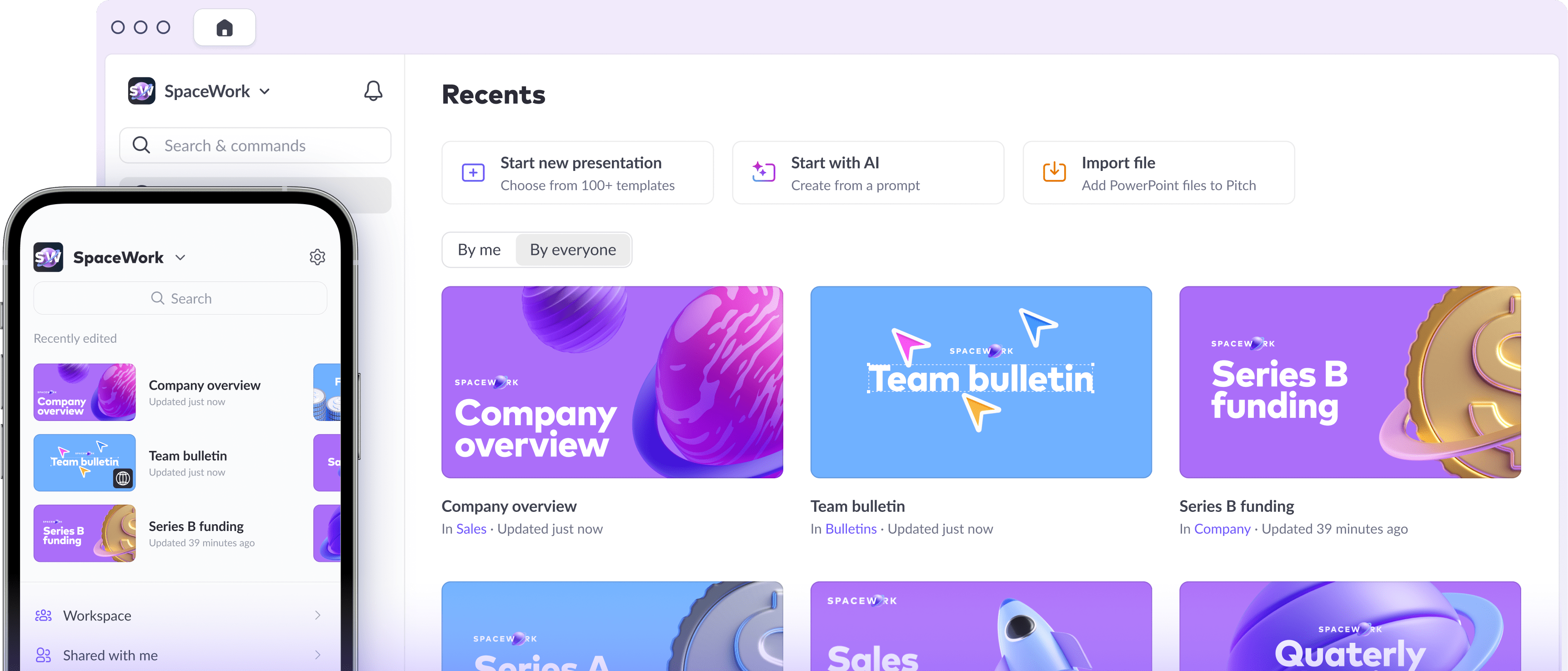
We held weekly feedback rounds with stakeholders that were open to everyone so that anyone could review progress, provide feedback, and challenge assumptions throughout the process. We also added slides to our weekly team bulletin so that everyone would be kept up to date.
Break out work for product teams and monitor progress
One of the biggest lessons we learned is that it’s really easy to go too far. It’s critical to always sync and prioritize efforts based on the roadmap, otherwise you begin designing for the future, but end up with a version fit for 2050, not 2020. By always coming back to the reality of the roadmap, it's easier to identify the areas that need a lot of detail work and those that only need to be a walking skeleton. This also ensures all resources (people and time) can be managed more efficiently.
The big reveal

So what’s final product look like? Read more about the big reveal and take a deeper look at what we hope this means for users in this post.