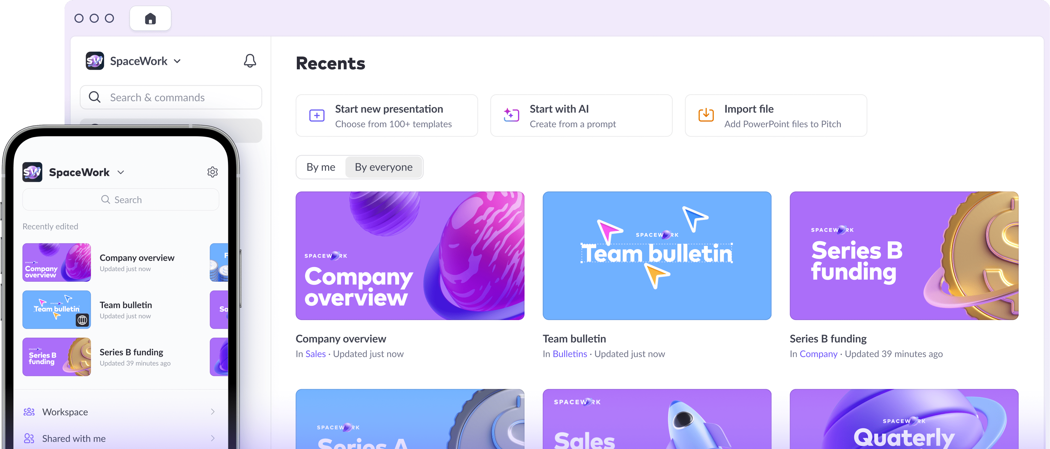
A top VC's recipe for an eye-catching pitch


If you’re a startup founder seeking funding for your big idea, your ambition and charisma will only take you so far. You're counting on investors to lend a hand with the resources you need to pursue your dream, but they’ve never been shorter on time or attention. So how do you design a pitch deck that commands attention and helps you ensure your idea gets heard?
Martin Mignot knows a standout pitch when he sees one. The Index Ventures partner has established himself as one of Europe’s top VCs by leading early investments in unicorns like Deliveroo, Personio, and Revolut. Mignot has reviewed thousands of aspiring entrepreneurs’ pitch decks, and has a gift for spotting a diamond in the rough (and knows when he’s seen enough to make up his mind). We recently caught up with Mignot to pick his brain on the do’s and don’ts of designing and delivering pitches that break through.

As someone who has reviewed thousands of pitch decks, what do you look for first?
The first thing you try to do is to find the core information quickly. Who is the team? What is the problem being solved? How is it being solved? Who is using the company’s product? How are they using it? You’re looking to get a sense for what the business is like.
So for an entrepreneur who is designing a pitch deck, what’s the most important thing when it comes to conveying this information effectively?
Making sure you present the right information — and not more. Anything that’s too long, that’s not to the point, becomes part of the noise and gets ignored.
Length is a good point. People talk a lot about making sure a pitch deck hits that balance between being informative but not boring. Is there a rule of thumb you generally suggest when it comes to length?
If you haven’t conveyed your key information in 12 slides, it’s probably too long. You can have an appendix if you want, but if I read 12 slides I should have everything I need to know.

Let’s talk about visual storytelling. How can entrepreneurs make sure their visuals add to their story, and don’t distract from it?
The best pitches typically tend to be conversations. Effective visuals help kick this conversation off. Really any sort of visuals that are surprising, challenging, or unexpected, those are the visuals you should be aiming for.
“The best pitches typically tend to be conversations.”
Ultimately it’s a story. You want the founder to take you into their universe. When someone comes with a pitch and just talks at me, trying to cram all the information into 25 minutes and just opening up for questions at the end, that's the worst. I want to be carried across a story where I participate. It’s a bit like immersive theater. The storytelling is a journey that takes you somewhere, but you should also take part in it.
We've talked about designing a pitch deck, but presenting a pitch deck is a whole different beast. Thinking about the best pitches you've heard, what role does the slide deck play and how does it complement the speaker?
Today, decks need to be versatile enough to fit into two contexts: There’s the deck I read at home on my desktop. Here, I should have the information I need to know what’s going on. And then there’s the deck we review in our conversation, which should have things that call for questions, for clarification, or for explanation. Conversation openers.
Now more than ever, founders have to make sure their deck is compelling enough to stand on its own, even if they aren't able to deliver it in person. Do you have any tips for how to make a strong impression when pitching to VCs through a virtual medium (e.g., Zoom)?
Honestly, pitching is better today. Sure, I miss the physical part of pitching in person, but the virtual format removes a lot of the friction: scheduling, commuting, setting up the laptop. The physical world made it trickier to showcase digital content. Moving into a fully digital world has made it much more seamless. Even the rare technical glitches don’t really add on a lot of wasted time.
“The importance of having a well-designed pitch is even greater today.”
Before, most of the time when we meet with founders, we wouldn’t even have time to really go through the pitch deck. Today, every single pitching meeting involves a deck. The deck is the background of the discussion.
We can’t talk about startup pitches without talking about data. After all, so much of a pitch deck’s story is told in numbers. When it comes to storytelling through data, do you have any tips?
In my view there are two important sets of numbers when it comes to visual storytelling: There’s the macro and the micro.
Macro is all about market size and potential. Here, you want to see visualizations that use bubbles and areas to get a size for the scale, visual cues of sizes in comparison to each other. And then on the micro side of things, what’s very important is unit economics: If you sell one of something, what is your actual revenue, margin, and profit for the company? Here it’s all about waterfall-type graphs, which are great for breaking down each component.
One thing that really grates on me is when founders use cumulative data, like cumulative revenue, which is obviously hugely misleading. People know you want to see graphs that go up and to the right, and of course if you use cumulative numbers that’s what you see. It’s always going to go up and to the right! These visual tricks doesn’t mean the business is doing well.

Martin, we know your time and attention is in high demand. Thanks again so much for sharing it with us today. One final question for you: Is there information that startup founders should never include in a pitch deck?
Anything about exits. If you are raising Seed or Series A round and come in talking about how much you can sell for or IPO for, it gives the signal that all you're really interested in is exiting. It's too early for that. Instead, focus more on the size of the opportunity and how big of an impact you can make if you’re successful, but talking about how you’re going to sell the business you just started is typically the wrong way to think about it.
Martin's top tips for delivering the perfect remote pitch
Do keep it short. You should be able to cover your key points in 12 slides.
Do make sure your deck can stand on its own, especially if you aren’t there to deliver it in person.
Do use visuals that function as conversation starters.
Do make sure to engage your audience and not just talk at them.
Don't try to use visual tricks to make your stats look better than they are.
Don't talk about exits in your initial pitch. Instead, focus more on the size of the opportunity.