Pitch 2.0: A behind-the-scenes look at the product’s redesign


You might’ve seen that we recently launched Pitch 2.0 — our biggest release since Pitch’s debut back in 2020. As a Senior Product Designer, I was involved in the initial planning phases for the release; our user interface was going to be a very visible part of Pitch 2.0. That meant identifying cracks in our UI and assessing the current software landscape, where design excellence is constantly pushed to new heights by tools like Linear and Craft. It was the perfect time to take Pitch’s product visual language to the next level.
After all, let’s face it: Pitch was dwelling in a murky grey borderland, drowning in dividers and sections (hence our internal project name, “borderless design”). That said, we never set out to fully reimagine the product. We follow a strict design philosophy at Pitch, where every new feature has to be worth the space it takes up. We want to be a powerful, cutting-edge platform — not another presentation tool with thousands of menu options *cough*.
The redesign was a timely update to help our product continue to stand tall against the backdrop of modern software. And this is your backstage pass to the creative chaos, meticulous tweaks, and strategic decisions that birthed the sleeker, more sophisticated Pitch you see today.

Taking an explorative approach
At Pitch, we believe collaboration is the backbone of innovation — so we kicked things off by getting everyone on the team to explore and play with visual styles. This helped us understand where individual designers saw potential to evolve Pitch’s visual language, and where we all stood on what “modern software” looks like. Ultimately, this approach also served as a fun way to get everyone involved in the project.
Simultaneously, we did a teardown of the existing visual design. We plastered hundreds of stickies over our key screens, highlighting inconsistencies, eye sores, and anything else that made us cringe. Armed with the insights from this exploration, we established two guiding principles: simplify and modernize. This wasn’t about tossing everything out; we were embarking on a calculated evolution.

Starting with the grid
The grid is the heart of any UI. It defines how elements are sized and how they’re spaced apart, and enables a cohesive rhythm and flow for content.
But our flow was off. Buttons and interactions were small and hidden. We wanted a more open and friendly feeling, so we shifted from a 6px to an 8px grid. That might sound minor, but it paved the way for a cascade of improvements.
“This wasn’t about tossing everything out; we were embarking on a calculated evolution.”
Our buttons and inputs went from 30px to 32px. We rounded corners just a tad more. Toggles and checkboxes got bigger. And in many places we reduced sizing and padding to accommodate content. One seemingly small shift allowed us to make incremental changes to all our elements — and be more in sync with the Pitch brand.
Tightening up the typography
The Pitch app has always relied on two typefaces: Lato and our brand font, Mark Pro. Lato is primarily used for body and headline copy, while Mark Pro is reserved for main page titles.
But the size contrast between Lato and Mark Pro was huge, so the titles felt overpowering and disconnected from the rest of the app. By tweaking our type scale and extending the brand font into the editor, we made our typography more approachable and streamlined titles into the overall design scheme.

Neutralizing the blues
Our action color needed a makeover. Not only was this color different to what our overall brand and website were using — drowning everything in blue was so yesterday.
Acting in line with our goal to simplify, we neutralized a lot of interactive elements in the menu as well as lower priority buttons. Then we used the action color to highlight important items, which better guides users’ attention and creates a calmer and more focused UI.

Creating crisper borders
As a creator tool, our UI lives alongside all types of colors and backgrounds; it’s natural for the UI to overlap with the canvas at times. But our solid border colors — fuzzy and muddy — were a sore point.
We tackled this by switching to transparent colors and using shadow rings to create the borders. Now, instead of awkwardly crowding the popovers, the borders gracefully fall outside the elements. They’re noticeable on light backgrounds, but seamlessly blend into darker colors.
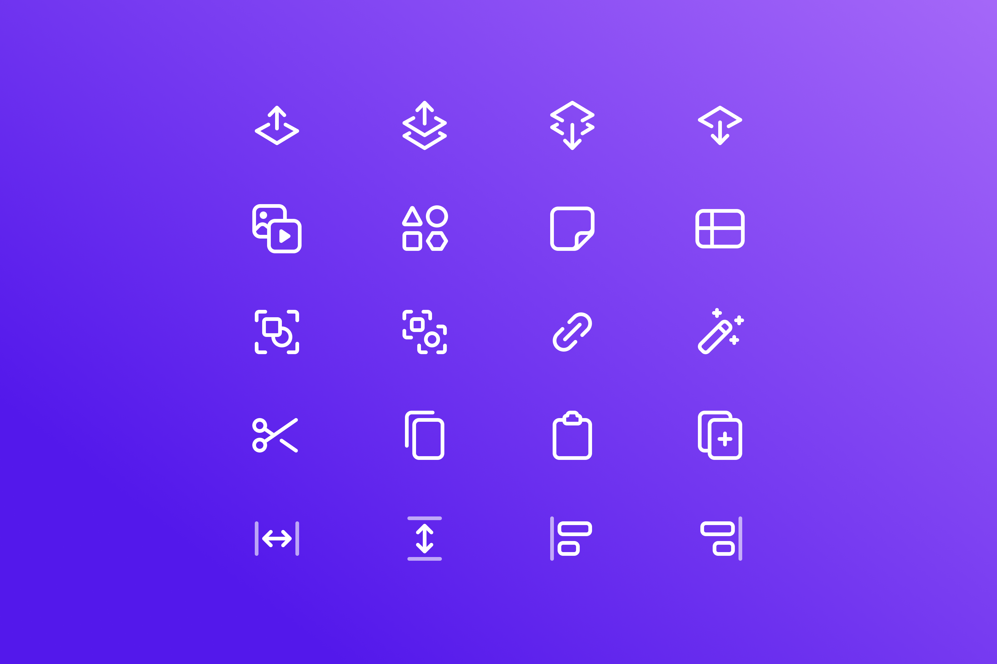
Building bolder icons
Our original icons, crafted by the talented Martin David, paved the way for where we are today. But as we added more custom icons over the years, some became misaligned, improperly sized, and caught up in complex metaphors.
Seeing an opportunity to align with a brand that’s grown and become bolder, we revamped the icons. We embraced simpler shapes and common metaphors for instant recognition. After exploring various styles, we settled on a 1.5px stroke, adding weight and visual significance to our icons.
These icons were designed in a tight window. We’ll continue to iterate on them, making sure to keep things fresh and aligned with our evolving brand.
Simplifying the editor toolbar…
In our pursuit of simplicity, we decided to revamp one of the core areas in the editor — the toolbar.
Over the years, custom buttons and overrides had cluttered the space, creating confusion, inconsistencies, and a puzzling hierarchy.
We smoothed out the complexity by unifying button styles, prioritizing key actions, introducing a more accessible menu button, and smartly tweaking the order in which they appear.
…and the dashboard layout
In our bid for visual perfection, we didn’t stop at the surface; we made impactful changes in the dashboard layout itself. The previous setup — with five components, tangled sidebars, and headers — lacked clarity and carried unnecessary visual baggage.
We distilled the layout down to just two columns, and grouped crucial navigation items together. We also implemented common patterns for workspace switching, and positioned titles higher up in the viewport.
Elevating key actions
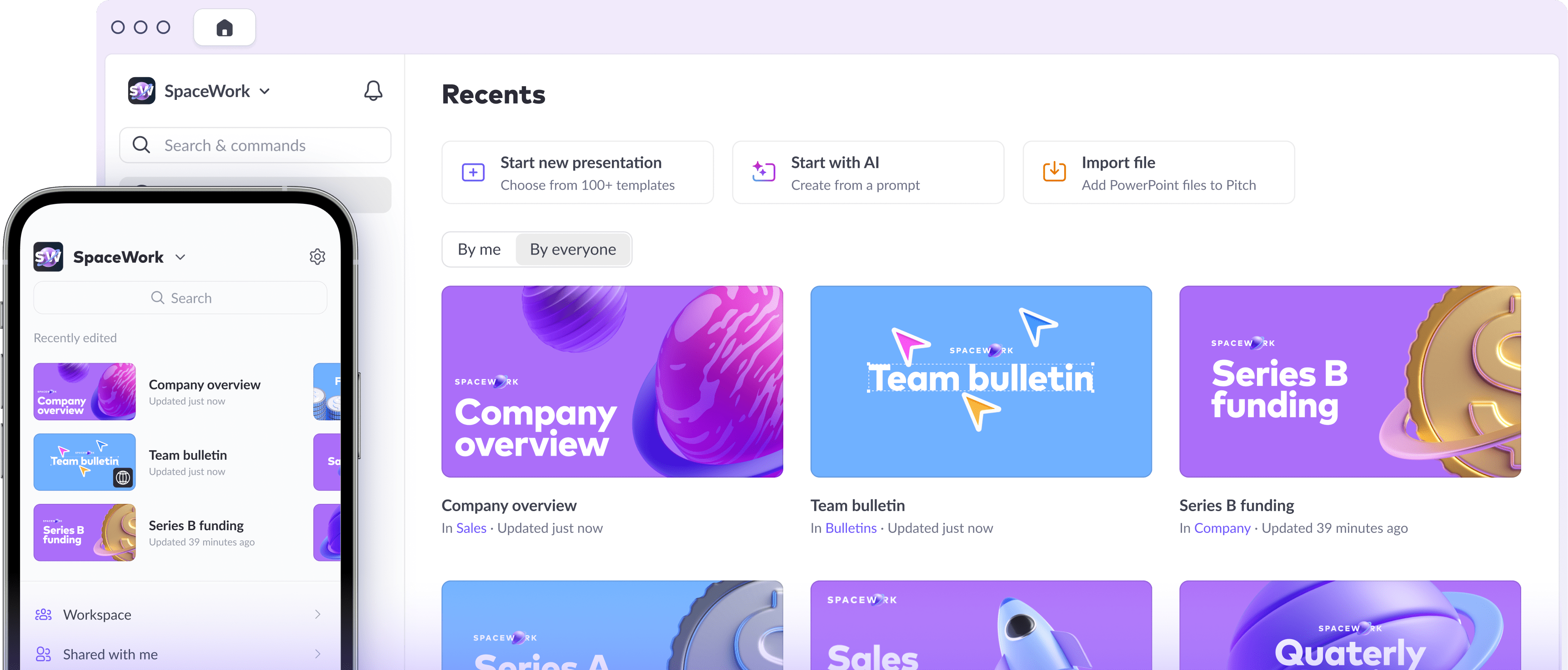
With the introduction of our AI presentation generator, we knew we needed to more clearly signpost the multiple ways users could start creating a deck. As we bid farewell to the title bar in the dashboard, we embarked on a quest for the optimal spot to showcase these options.
We’d previously explored having a row of action buttons, and decided this would be a good time to see it through. This solution allowed us to highlight multiple key actions, and inject some subtle but delightful interactions in the process. The additional options moved down one level: Clicking on Start new presentation now reveals the more specific options to Start from blank and Import file alongside the available templates.

Bringing it all together
When you weave all these changes together, you get a Pitch that's more elegant and less noisy. Elements are easier to find, and content is a breeze to scan. Don’t just take my word for it: Since launching Pitch 2.0 (almost exactly) one month ago, there’s been a 31% increase in quick menu usage, a 1088% increase in visits to the Library, and a whopping 1481% jump in users uploading Library assets.
These results are a testament to the collaborative effort of our talented team, and I couldn’t be prouder of where we’ve landed with our refined visual design. With a tight timeline, the team went above and beyond to deliver the improvements. We’ve laid a solid foundation, and are eagerly looking forward to building on it and crafting new, future-focused features.
A special shout-out to Adam Gamble, Aneliya Kyurkchiyska, Anton Volkov, Brendan Donovan, Eric Labod, Kathryn Lawrence, and Tom Bogner! Let us know what you think — we’d love to hear your feedback — or join the discussion in Pitch’s user community.
Spread the word